Tuesday, February 18, 2014

Check Spoke Tension with SmartPhone


Just a quick video using an app. I tried gStrings, a guitar tuner but the"Check Spoke" App (here) had better filtering for frequencies and added regression if you know the length, diameter, and material of your spoke.

Haven't checked to see if there is a good iOS equivalent yet, but I'm sure there are guitar tuner apps. Just match the frequency of the spokes, if a spoke it way off you might adjust it down. Keep in mind there is a balance between a true wheel and good spoke tension. If you aren't careful you could mess up how true your wheel is to fix the spoke tension, or more commonly, the spoke tension is messed up to fix the trueness.

Saturday, February 15, 2014

Training Peaks Beta

So first I want to admit that the beta has actually done a very good job addressing the upload issue. Seen below is the Google-esque drag and drop into browser to upload feature. Seriously pretty cool. I uploaded several of my workouts like this.

image

However, Training Peaks did reward my frustration with their older site with and upgrade to Pro for a week – which means tapiriik sync functions (at least until the trial expires / when I pay for a month it expires). I’m quite happy about this, and as Ray over at DCrainmaker commented, I shouldn’t get too upset about lack of API’s. Garmin doesn’t officially have one and has been throttling tapiriik.

image

The Beta, having addressed my upload issue, is going to be the focus. I firmly believe that a company isn’t going to stop developing a web app, so honestly they are really perpetual beta. I think for Training Peaks has alegacy group to support though. I’ve seen this in Mechanical Engineering software Catia. They have a version+revision system (such as V5R18 which stands for version 5 and revision 18), however while releasing new revisions of V5, they are concurrently building V6R7. It has to do with projects that are too big for a company to switch at one time and allows them to make great changes without alienating their customer bases.

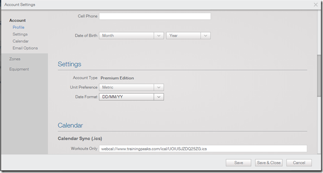
The first thing you might want to do (Unless you live in the US) is that you’ll likely want to click on your name and go into the settings menu and fix the default from miles to kilometers and the date to DD/MM/YY. I have opinions on the Imperial versus Metric, but this map sums it up better than I can put into words.
image

In the settings you’ll find something really cool but nerdy stuff. For instance there is a Workouts / Meals Calendar sync link. You can sync your Outlook or Apple Calendars to TrainingPeaks. This is a first from what I’ve seen and something that I desperately want to trial though haven’t had a chance to set it up.

Additionally this is where you’ll set your Heart Rate zones (via manual input, or many varieties of calculations based on a small amount of inputs). You’ll likely need to do a bit of research or examine your previous files going into adjusting these.

image

You can also go into the equipment tab, but honestly I’ve never seen much point to equipment tracking. I like that it has it, but I just don’t see it as beneficial. I mean some people will love to track shoes distance for replacement purposes, but for cycling I find a keen eye on your bike and checking it is going to be more effective than trying to manage it via a software solution. I’m likely unique in that I do all my own bike building and maintenance and I would suspect that the vast number of cyclists do not. It certainly has other use cases, such as differentiating mountain from road bikes.

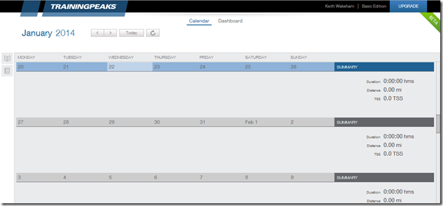
So now that the basics of setup are out of the way it’s into the Calendar view I go. It’s a clean interface – I like it a lot better than the previous one (which I’ll stop mentioning now). It seems to automatically default to today on the top row, which means you have to manually scroll up to see last weeks work outs. At first I didn’t like this, but it makes a lot of sense from the perspective of seeing your upcoming plan – the dashboard is where you’ll look at old data in a big picture kind of way so this makes sense.

image

Over to the dashboard we see something similar to SportTracks.mobi with the pie charts.

image

Click on the little tab on the top left hand corner and you get a list of some really well thought out graphs, yet I’m not overwhelmed by the number. You simply drag and drop  them where you want them. It provides me with very useful graphs within seconds. It’s clean and smooth (even on my older underpowered laptop which is super nice).

image

The only major complaint I have is that it feels very much built for a higher resolution display. If you’re running a 1366x768 (the most popular resolution by a 3:1 margin for Jan ‘14) then consider an upgrading your laptop(to maybe a Lenovo Yoga 2 Pro maybe if you want 3200x1800) as you’re not going to see anything more than two graphs at a time. Forcing my browser to zoom helps with the graphs but becomes a real problem for the text. It would be nice if there was some scalability of the sizes. This may be a short lived issue as almost every screen is going to be higher resolution soon in the mainstream over the next two years. However, then it’s the flip side, how well will it cope with a 11.6” quad FHD screen? So I would like to know how it deals in the opposite direction – the ultra high resolution screens. I suspect this is eventually going to be handed to the OS’s in the future, at least I hope.

image

I don’t know if it’s maybe just my personal preference but I honestly really like the colour scheme. Another thing to note is that using Training Peaks logged in on two systems and making changes to the Dashboard on one system means a refresh will get the new stuff to show up on the other. I don’t know if that was planned, but it works.

One of the things they have done well (which is a port from WKO+) is the summaries. I really love this summary type. It breaks down my last few weeks, then breaks down the last few months below it. It’s a mental thing I find; you aren’t going to remember that run six weeks ago, but you’re going to be fairly fresh about your most recent workouts. However you’ll want to see how you’re progressing on a month by month basis. Since I have a major cycling focus the 5s, 1m, 5m, etc powers are important. It gives you at the second glance.

image

Something I find even more important than that is the Performance Manager. This is the graph that will give you your TSS, intensity factors, TSB, etc. It’s a great view which I wish more sites would replicate.

image

The level of customization goes deep with CTL and ATL constants. This is something I never got into before, but it makes sense to be adjustable because two people could have very different recovery times. Some people may recover faster than others and some slower. This is something that I’m inclined to leave alone mainly because I suspect changing it requires a combination of coaching and training experience with very good feedback or potentially long term testing. I’ll go out on a limb and guess that Training Peaks have selected the median values and you generally won’t need to touch them.

image

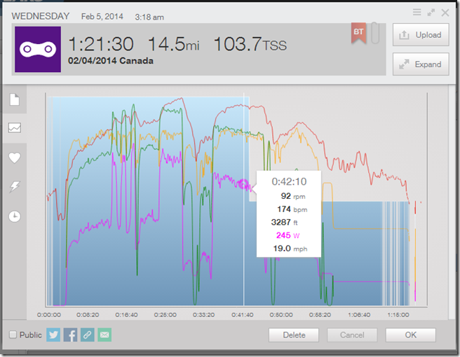
I’ve done some basic exploring. Mainly looking at my workouts. At first I wasn’t keen on the pop up windows but the more I used them the more efficient I felt they were. They gave me everything at a glace and I didn’t have to constantly navigate pages. It’s different, and if you walk into it with an open mind you’ll appreciate the workflow.

image

image

image

image

Some of you might have seen me post about my old trainer software (which was before TrainerRoad, and now, not nearly as good – seen here). I designed it to save files in a Powertap replicated format. However it left the ID field blank, but manually rectifying this (place 0’s in the field) meant that Training Peaks Beta could read them – dragging and dropping them put the file on today’s date. I’d like it to have popped up asking for these time and date missing files should go – but I’m generally just impressed that it worked at all.

image

Since the CSV file has no true time stamp information (I save them automatically by date, but that doesn’t count as real meta data) there is a nice way to edit them. Opening the workout and clicking on the date produces the very familiar month menu’s. These are generally quick and easy to work with, unless you’re trying to upload a workout many months ago, but at that point it’s impact to CTL is so negligible that it’s mainly only for historic significance. If you really want to explore that old CSV power file from 3 years ago you can. It’ll just be a bit of a pain to get the right date but it certainly lets you.

image

All in all, the beta is what I should have looked at first.

I’m exploring implementing my workout plan and I’m bumping into a couple of limitations of the beta. It seems that plans can be added from the store in the Beta, but not manually. However a plan is just a series of workouts. So I went to the workout library and found my first limitation of the beta. Adding a workout has not yet been implemented. So with great hesitation I figured I’d switch to classic temporarily to see if it’ll show up.

image

However, I’m stopping there as I don’t want to review the “Classic” interface. I plan to put my plan into it and since Joe Friel is closely tied to Training Peaks as well it has an automated interface to put in a plan.

image

Cost

Training Peaks is the most expensive online tracking platform I’ve found at $20/month USD. I like subscription models for two reasons

  • Cost of access is reduced
  • Ensures Developers keep working on new features to be competitive

Being the first paid piece of software that I’m looking at, it’s hard to say if it’s analysis features make it worth the money. I’m still researching TRIMP as a tracking method compared to TSS so I can more accurately compare feature sets between different Web apps.

Bottom line (so far)

If you’re new to Training Peaks don’t bother with the Classic interface for tracking your work outs and analyzing data – however, unless you buy a plan you’ll be forced back to Classic to input yours. Hopefully this will be fixed soon.

Pro’s

  • The drag and drop to upload feature, very good functionality
  • Dashboard – simple,effective, and customizable – great historic graphs and listings
  • Can do a rTSS calculation for running, making your runs automatically useful for tracking training stress scores / balance
  • Interface and navigability in the Beta is much better than the Classic interface

Con’s

  • API for Tapiriik syncing only available in paid version
  • The drag and drop to upload feature is not intuitively know – I had to be told about it
  • Not everything from the older “Classic” interface hasn’t been ported

Saturday, February 8, 2014

TrainingPeaks (Free Version)– A Frustriduciton

Continuing on the reviews, we’re going to move onto Training Peaks. As previously alluded to, they are widely considered the Masters of training and racing with a powermeter. Their offline software, WKO+, has been used by major coaches all over the world.

As with SportTracks.mobi, there is things that I didn’t have a chance to look at and missed. However, I plan on updating things further when I figure them out. There are some issues with Training Peaks that make the user experience painful. I’ve used a demo of WKO+ 3.0 before and I’m very excited about 4.0 even with what seems to be never ending delays.

Training Peaks Online

Training peaks is strongly associated with Hunter Allen and Andy Coggan, the authors of Training and Racing with a Powermeter. This is the book I previously recommended. They are coming out with a new version of their offline software, WKO+ 4.0 and have been running webinars about some “Black boxphysiology math.

What I mean is that you give it your input (your ride / test data files) and it gives you back and output such as telling you your FTP has increased, decreased, etc – but it neglects to tell you how or why. I’m a big fan of open source hardware and software which is where the beginnings of this blog originated and will continue to support in various projects. Feel free to make your own comments and share your opinions on Black Box technology. Personally, I feel disdain for it.

So onto the web app. This is the first page you’ll see: It gives a nice calendar view which provides a great history. You can switch to weeks, list and day views. You’ll notice I don’t have any data here – we’ll try and fix that next.

image

Let’s upload some data to Training Peaks. It is seamless with Garmin Connect, SportTracks and Strava, and others I’ve tried – and maybe this is because I have two of the most popular devices (Garmin Edge 500, Forerunner FR910xt). So I need to find that pesky upload button. It doesn’t seem to be on the main page (or every page on almost every web app I’ve tried). After a little searching I figured this is because they are focusing on the new beta page and maybe this is a legacy thing. I assume that the new beta page will have an upload button in the corner.

image

Still no upload? I have barely ever read a manual in my life, and I’ve never seen it required with a web page. However, I’m getting seriously frustrated so I’m consulting the help file

image

I read that my options include:

  • WKO+ Desktop software (I’m looking at WKO+ 4 purchase whenever it comes out), but the whole point of a web app is access everywhere and not having to install software on every computer
  • TrainingPeaks Device Agent – Seriously? I already have the Garmin ANT+ Agent, I need another one! Strava can upload via the Garmin Communicator plugin, this is more than surprising.
  • Upload from Quick View – File upload; I’ll tired this first.  Why is this practically hidden?
  • Upload from the item picker – Again, file upload like above. Again, nearly hidden!

I’m trying method 3, upload from Quick View. I click on a day (the wrong one – intentionally, because I want to see what happens – the .fit files have embedded time and date stamps as well as GPS data) and I’m manually uploading:

image

I specified Jan 13 and tried forcing Jan 22’s run.

image

So now I’ve put the 22’s run on the 13, the 20th’s run on the 14. Not a single issue here doing it. It didn’t pop up, or alert me, or just override my choice. Curious.

image

I have a huge issue with this. I want the ability to override things, but in the day of web apps and GPS watches / cycle computers / smart phones where time and date are set via GPS or Cell tower data I shouldn’t have to specify the day for each file. I can manually upload to the Garmin Connect site with the communicator plugin. So lets put this all right in terms of the dates. I’m downloading the Device Agent.

From the help page link I’m confronted with a 404.

image

However, finding it via Google to a live link on their site I download the TrainingPeaks Device Agent 3.0 and install it. Once open I select the Garmin Forerunner 910xt and click open files (That’s questionable; why not upload?).

image

I’m shown a listing of files in the Garmin Folder. I’m confused to say the least. I downloaded a Device Agent to talk to my device, which I have with me.

image

WOAH! Hold on now!!!! It is just linking to my files on my hard drive that would only be there if I used the Garmin Agent. I’m not even 100% sure that Sporttracks or Strava doesn’t do the same for ANT-FS based devices, but it does it without me thinking. With the Edge 500 they both talk directly to it (because it shows up as a drive, the FR910XT needs to use ANT-FS)

This TrainingPeaks Agent didn’t communicate to my Device via ANT-FS to get the fit files directly from the device, it went to the Garmin folder for the Garmin ANT Agent. This is a hack / cheat / workaround if I ever saw one – and having “Hack” in the name of my blog means I love hacks – but why did I have to download a piece of software to do this? If I didn’t have Garmin ANT+ Agent installed and uploaded to the Garmin Connect site via the Agent method then it sounds like I couldn’t use the files. Maybe others are using this cheat too, but I manually had to select the files to upload via the web interface (one by one) and tell Training Peaks when they happened unless I use the Device Agent – whose only benefit is to read the time and date and put it in the appropriate date.

image

I want to quickly visit the top bar of other sites though.

Garmin Connect

image

SportTracks.mobi

image

Strava

image

Cycling Analytics

image

And Training Peaks has an “Upgrade to Premium” button instead. Even the Beta has a big upgrade and not upload button.

image

image

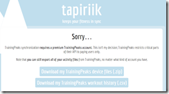
As a reminder, tapiriik doesn’t work unless you upgrade.

image

After this frustration fest I now have data. Lets look at the Dashboard. I’m starting off in negative calories which is concerning but I assume I need to put in dietary information.

It’s giving me very little in terms of summary. It’s highly customizable though which is similar to WKO+ 3.0 which is nice. However, nothing is setup as a default to give me summary data.

image

You might be asking why I’m giving TrainingPeaks a hard time on this. The simple reason is that their desktop software was one of the first and widely considered the best, and they’ve spent a lot of time migrating almost all of that functionality to the web because it needs to almost fully complement WKO+ for the WKO+ desktop to web app uploading, but they seem to have forgotten that web apps aren’t just straight desktop translations and that their customer base have $200 – $1000+ in hardware that they want seamless integration and are given that with almost all of the competitors.

I like Specialized Bikes motto: Innovate or die.

Something cool happened after I had data into the site. I got an email notification when an algorithm detected something – though still not a fan of Black Box Algorithms but I did like the nice clean email that notified me of this stuff.

image

Bottom line:

Honestly, this has been the most frustrating web apps to track my data that I’ve seen. I’ve spent way more time on this site than any other and found I was quickly going nowhere. I desperately wanted it to work well and I tried and tried. I wanted the kings of power to help me analyze my training plan data going forward, but I found I barely had data into their site. If you’ve more experienced with WKO and their products, it might be easier since you know the tricks to make it work – but my point is that the competitors “Just work”. If you’re new to tracking your data, this experience will leave a bad taste in your mouth.

Pro’s

  • Customizable everything, from charts, dashboard, etc 
  • The “experts” in power

Con’s

  • Actually using it
  • Getting your data in
  • Upgrade instead of Upload

I’m hoping I’ll come back to it when I upgrade to Pro so that:

  1. Tapiriik works – Seriously that is a laughable childish money grab rule to make your API only work on the paid version. Garmin works, Strava works, Dropbox works, and more
  2. I can explore all my historical data
  3. Explore annual training plan – apparently also a paid feature

However until then I feel I’ve invested too much time already. If you can’t just switch on and start using something like this, you’re doing it wrong. It’s hard to give money to something that doesn’t work well in the unpaid version, it’s a fools errand to follow through on a paid version hoping it’ll fix that.

Tuesday, February 4, 2014

Sporttracks.mobi and Tapiriik


I wanted to do a basic introduction to a few of the web apps but the post quickly grew too large. If people alert me of changes and issues I’ll look at updating this post. As always email me here.

I’m still working on editing my training plan. The reason for the change is I was too aggressive and I need to subscribe to the 10% volume / Intensity rule (don’t increase volume or intensity more than 10% form week to week). This means I’m going to get rid of my last build before my first race and make the transitional period longer. As such, I’m having to redo some of my work to date. This means that a lot of the apps need more time but I figured I can look at SportTracks.mobi

SportTracks.mobi

SportTracks.mobi is the online web tracking software from ZonefiveSoftware, the maker of the popular offline tracking software, SportTracks. This is one I missed on my first pass but I’ve spent some time with it. Initially I wasn’t used to the darker interface, but honestly it looks nice. It gives it a flat Windows 8 type feel which I generally like.

Lets start off with the device upload. I click the “Add workout” button, it drops down to “Device import” and connected seamlessly (after I allowed the Garmin Communicator Plugin).

image_thumb79

image_thumb74

That was seamless and nicely integrated. Once I get back to the dashboard I’m instantly given a lot of data (and disappointment in my own performance).  This is a view that I’m not 100% use to. Initially I felt it was “busy” but once you get use to it (which takes just navigating the site for a few minutes) you quickly realize it gives you a lot of information.

image_thumb89

One of the cool and surprising things here is that you can click on a lot of this data:

image_thumb179

I’m no Ray and I’ve been away from serious exercise for about 2 years while I focused on engineering. So forgive my weak performance. And that brings you into a more detailed view of the week you selected. This overview gives some nice basics in this weekly view but nothing ground breaking. I’m not sure the energy calculation in use here, but I found I couldn’t change it to calories. Living in a metric country means I should probably use kilojoules, but most people are more familiar with calories.

image_thumb94

I’ll get back to the Analysis tab shortly. Next lets check out the gear tab.

image_thumb99

That’s not what I expected? I expected it to now say “Garmin FR910xt” because I uploaded from it.  So this is obviously more a bike / shoe thing, so clicking add brings up this:

image_thumb104

(The fields weren’t populated and the terrible face / bike picture was manually added just to test)

I fill in the info, but annoyingly you couldn’t drag the image into it, you manually have to select the file to upload upload. This is the most minor of nuisance and is only a nuisance because I’m too use to Gmail and Google Apps. I did find one minor fault. The time zones.

image_thumb109

It would be nice if it was a basic listing of +/- GMT numbers. This just feels overtly complicated (like the use of the word overtly there). Most forum sites use the +/- GMT numbers and if they subscribe to daylight savings time. It’s a little clumsy but you only have to do it once so an easily forgivable sin.

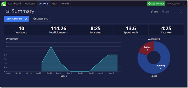
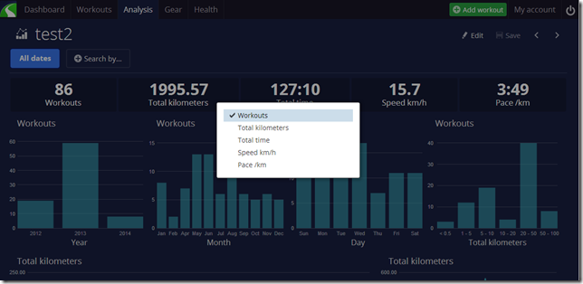
Back to the most important tab, Analysis. I have to say that the analysis summary gives a nice overview of what’s going on. The big graph is nice, and the pie chart breakdown is interesting. I think it’s based on number of activities – this can skew it if you do short runs with longer rides, or the reverse. However, Since I’ve only uploaded data from my watch and not the 50 – 60 last rides on my Garmin Edge, it’s a little skewed and limited in terms of what I’m seeing.

image_thumb184

Clicking Running brings up a little more detail but not much, just removes all the cycling related stuff.

image_thumb189

You can use the arrows at the top right to

image_thumb201

This will give more Dashboard style data.

image_thumb193

Clicking the health tab brings me here but I haven’t manually input anything. I tend to dislike manual inputting workouts / data but as I don’t own a smart scale I can’t test if it’s compatible or if there are ways to get the data in.

image_thumb205

Lots of potentially interesting stuff, but I didn’t have data for any of it. However I did link it to my other sites with Tapiriik so that I could spend some more time.

image_thumb232

Now I get a lot more data in the Analysis area and it skews more towards cycling which is good.

image_thumb237

The downside is you’re not going to find things like Acute training load (ATL) or Chronic Training Load (CTL) or Training Stress Score (TSS) or Normalized power (NP) here (all of these are Trademarked for Training Peaks, so if you see them used it’ll mean they are licenced generally). However they have implemented TRIUMP (talked about here on the Sporttracks.mobi blog). This is an alternative that tracks your effort and is based mainly on heart rate and time in zones.

image

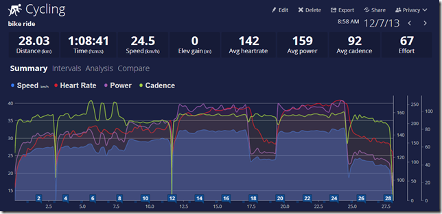
TRIMP or Training Impulse is a nice way of judging things, but it’s not something I’m familiar with having been using TSS / ATL / CTL the last time I was seriously training. It makes sense in a way, as it can normalize all your sports, but for me things brings into question how well it does that. I find a half an hour run much more strenuous on my body than an hour of cycling, yet an older cycling activity for me has an effort of 67 to a half and hour run of 24. This isn’t a limitation of Sporttracks.mobi, but TRIMP. There needs to be more work implementing TRIMP especially on the long term stuff. Right now I can only find it in an activity and nowhere else.

image

There is a customizable page in the Analysis tab. I’ve been finding it useful, but I can’t plot out TRIMP over time which is disappointing. Having just been loaned Jack Daniels (not that one, I’d recommend checking it out here) book on Running it was interesting to see a very nice point system that he implemented. I was hoping for something similar but I did not find anything. It could map speed and pace over time.

If you click on the analysis of a cycling ride with a powermeter there is some interesting stuff. They are adding new features, the newest being critical power and zone calculations. This feels like they are leading into the TSS/ATL/CTL/NP stuff but it isn’t implemented yet. I suspect we’ll see this feature set grow over the next year. You don’t get this estimation curve for other things, only for power.

image

image

image

The export as GPX and TCX is nice. You can’t have a web platform and refuse to let people get their data back so SportTracks.mobi earns top marks here. The social side of things isn’t as strong as I would have thought. The SportTracks offline desktop software was described to me as more for serious athletes (with some seriously cool plugins) and the .mobi is more social tracking. It has email and Facebook sharing and some nice and simple privacy controls. However, finding anyone I knew proved difficult. As much as I hate linking Facebook or Google to anything, I find in these cases that it’s a good solution to finding people if you’re after social interaction.

image

image

image

All in all it’s a good offering. It’s not what I’m looking for.

Pro’s

  • Nice interface and really nice visualization – customizable smoothing and more!
  • Low learning curve
  • No fighting to make it work or upload data
  • Tapiriik works with it and synced up very well

Con’s

  • Lacks TSS/ATL/CTL metrics for serious cyclists
  • Could not find any fatigue tracking over time to help you understand things like periodization in practice
  • Graphs need more customization options
  • No ability to create or use a training plan that I could find

Essentially it’s a good piece of software, but not for the serious athlete with a training plan.

Tapiriik

I wasn’t going to include Tapiriik in this, but my difficulties with Training Peaks (to be talked about later) had me itching to solve the upload problem via the Automatic Synchronization (popularized and crashing the site when DCrainmaker linked to it). And honestly, I donated the suggested $5.00 (Minimum of $2.00) so I could have Automatic Synchronization and not do it manually. I’m motivated to support Tapiriik because it’s cool. It’s been working great to get my old Garmin and Strava data into Sporttracks.mobi. I’d like to see other services added like MapMyRun/Ride and Endomondo and others. Though I think the limitations might be other peoples API’s and not Tapiriik.

image_thumb226

And now lets add TrainingPeaks.

image_thumb222

I’m going to pay for a month of Training Peaks upgraded version and see how it works. However in compiling my reviews so far, I’m less than impressed by Training Peaks online offering so far in terms of getting my data in their system. I’ll be posting it within a week hopefully.